Fonts & Freedom: Using Typography to Chart the Course of the USSR
Typography plays a crucial role in communicating, entertaining and educating. But, it can also be used to chart the rise and fall of the Soviet Union from its post-revolutionary optimism to it fracture and collapse just over 70 years later.

Bye-bye bourgeois art, hello Constructivism
The new Russia came with the rejection of everything old and ornate. In the wake of the 1917 revolution, the country was in the process of freeing itself from the grasp of the Tsarist autocracy. First the Assembly for Considering Simplification of Orthography was created to standardize written Russian. Four letters of the alphabet were retired by degree. Next the state encouraged Soviet designers. They saw it as their patriotic duty to create an entirely new artistic language in service of their new socialist utopia. Art was a reflection of a modern, industrial society. It had no place in an artist’s studio, or even in a museum. Instead "the streets shall be our brushes, the squares our palettes”. State-sponsored art was designed and mass-produced in laboratories and factories. It served the regime by singing socialist praises in books, magazines and on posters.
Many artists voluntarily joined organisations like the Association of Artists of Revolutionary Russia which sprung up after the revolution. These state-sponsored organisations gave artists unabridged creative freedom as long as the state was portrayed in a positive light. The aesthetic that emerged was Constructivism. It was defined by asymmetrical composition, a striking departure from before. Artists treated typography as a visual element in and of itself. It communicated, engaged and entertained. Typefaces were readable, but they didn’t just sit on a page. Artists like El Lissitsky would regularly manipulate type and its placement to emphasise a message. Words were kaleidoscopic, with dynamic rhythmic designs and were symbolic machine-age modernity. In a single sentence, letters could change in size or shape to create a feeling of movement or depth. Its impact was felt far beyond Russia’s borders, with Bauhaus and other avant garde movements taking and incorporating elements of Constructivism in their own work.
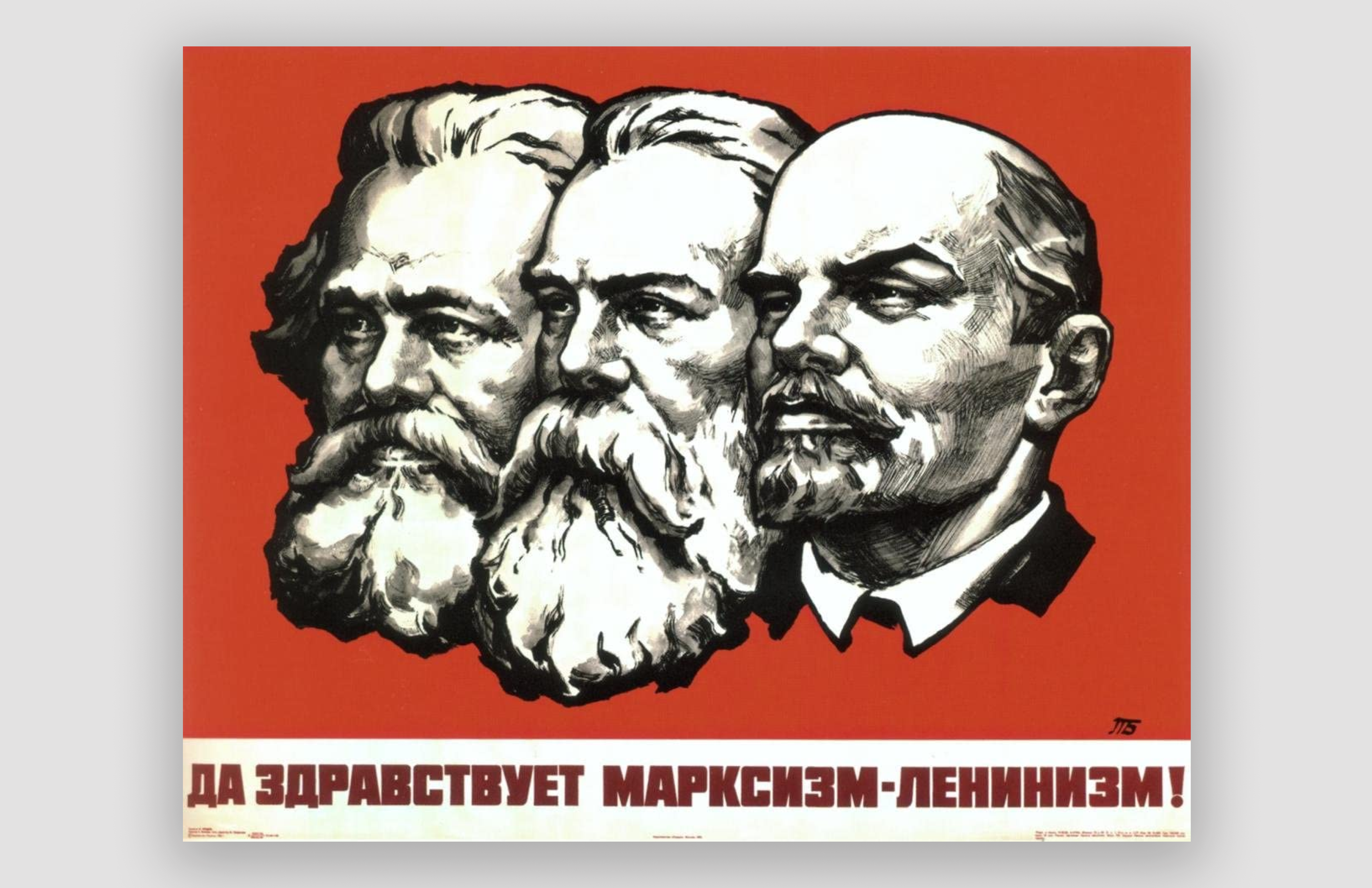
The Rise of Socialist Realism and the Death of Individualism
Influenced by the dynamism of Constructivism and Bauhaus, German typeface designer Paul Renner created the typeface Futura. With its knife sharp ‘V’s and wide circled ‘O’s, it combined function with beauty. It was called the font of the future. But, as the Nazi’s rose to power in the 30s, they began scrubbing it from public view in favour of the traditional script typeface, Fracktur. Back in the USSR, Stalin took a page from their playbook as he consolidated his power. With his rise came the death of artistic freedom. He believed that art should be 'true-to-life' and easily understood by the masses. Bold asymmetrical Constructivist fonts quickly disappeared from public view. The avant garde was considered the enemy of the people, and artists who practiced it were counter-revolutionaries. Like the Nazi’s who sent Paul Renner into exile, many Soviet artists fled to Europe. Those that stayed were banished, imprisoned, or even executed.
Next, Stalin stripped artists of their right to independently create art. Artists had to follow strict guidelines on subject and aesthetic. Art was now an official tool of the state. Through informal pressure, and later through policy, Socialist Realism became the sole artistic style of the Soviet Union. With this new aesthetic, came a new challenge for designers. Posters with propaganda slogans like ‘Workers of the World Unite’ and ‘Peace, Land and Bread’ needed a new typeface. They couldn’t borrow from the Europeans as their typefaces didn't have Cyrillic characters. Instead, they turned to Polygraphmash, the only type foundry in the USSR. In the late 30s, Polygraphmash created Literaturnaya, a serif typeface. Informally called "the favourite font of Russian typographers", it was used in magazines, newspapers, advertisements and posters. There was little other experimentation or variation in this period.

Stalin is Dead. The Rebirth of Typography?
The death of Stalin was quickly followed by the death of Socialist Realism. But, art still remained a tool of the state. In 1974, a group of Soviet artists organised an unofficial art exhibition in a vacant field on the outskirts of Moscow. The state organised hundreds of off-duty policemen, three bulldozers, a water cannon and dump trucks to suppress individual artistic expression. Artists and journalists were beaten and arrested, while bulldozers crushed the art. It’s organiser, Oscar Rabin, later said "the exhibition was prepared as a political act against the oppressive regime”.
In the 80s, General Secretary Mikhail Gorbachev enacted a series of wide reforms across the USSR. The state’s control over art was loosened but not gone. Under the state's watchful eye, artists were able to experiment with new styles and mediums. Many looked to the West for inspiration, the same way that the West had looked east almost sixty years earlier. At the time Polygraphmash was still creating font guides which specified that text should compliment the image. For more than fifty years, the state had enforced the directive that text serve solely as a supporting aid. By the time artists had more freedom to experiment, it was too late. The spirit and patriotism that led to the vivid and striking visuals of Constructivism was gone, much like the Soviet Union which collapsed just a few years later. Shop our typography posters below or explore the collection here.


